#2 Throw Back Thursday
I really wish that Craftsy had categories to add patterns to - something like the different Pinterest boards that a person has. Then it would be easier to choose which pattern you're looking for..... All my older patterns seem to just get lost in the crowd.
Today I dug out my "Have a Tea" pattern and given it a facelift, botox, lipo, the whole works.
The pattern block measures 16" x 18" and is now more of an art quilt or centre piece type of block. There is now decent instructions and charts too.
*** Now for something different:
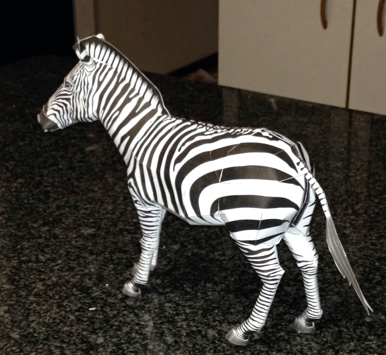
My son made this little model of a Zebra for me - it was a free 3D download cut-out that he printed out onto plain paper and then cut out and painstakingly glued together. The whole thing is about 18cm high and about 15cm wide.
Just look at this cute face, its amazing!
My son makes architects models etc, which are amazing too, but this is sooooooo cute!
The legs even have knees that stand out..... and look at those hooves..... oh my word!!
I just need to touch it up with black paints and it will be done...
Have a good Thursday!
https://www.facebook.com/QuiltArtDesigns


4 comments:
I love the zebra! What a talented son you have - he's inherited some of your creative genes! PS. I just used 2 of your patterns to make a tote bag and entered in the local fair - will let you know how I do!
di_caughill at hotmail dot com
That zebra is fantastic! I had to pull my daughter over to look at the computer.
OMG!! Love that zebra!
That zebra is cool, but I love the pattern more. Either or, I so agree with you on the categories idea at Craftsy. It gets to hard to even sort thru the many different patterns people offer whether free or paid. I'm not a fan of the one big scroll page either, if they had categories, it would not seem like an endless scroll page and after awhile that takes a toll on the browser as well. Well I've said enough about that, Enjoy your Day!!
Post a Comment